
How to Analyze Survey Data: A Complete Practical Guide
Complete practical guide
How to Analyze Survey Data: Complete Search Guide
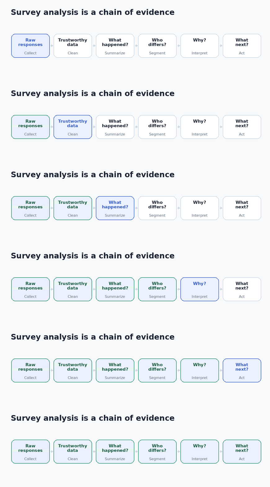
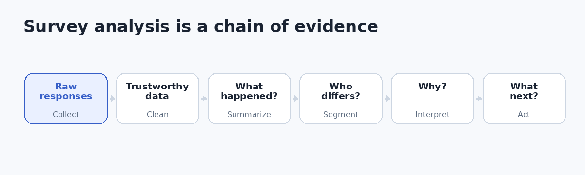
To analyze survey data well, first establish whether the responses are trustworthy, then summarize what happened, identify which groups differ, investigate why, test whether important patterns are credible, and convert the evidence into a decision.
That sequence matters because survey data analysis is not simply calculating averages and percentages. A polished dashboard built on biased, incomplete, or misinterpreted data can produce a more convincing wrong answer. The goal is to preserve a chain of evidence from the research question to the action you eventually recommend.
What Is Survey Data Analysis?
Survey data analysis is the process of organizing, cleaning, summarizing, comparing, testing, and interpreting survey responses so they can answer a research question or support a real decision.
Most surveys contain two kinds of evidence. Quantitative data comes from structured questions such as multiple choice, ratings, rankings, and numerical responses. It tells you what respondents selected, how common an answer is, and whether patterns vary between groups. Qualitative data comes mainly from open-ended responses. It provides context about motivations, expectations, frustrations, and experiences that fixed response options may not capture.
The strongest analysis usually combines them. Quantitative results tell you what is happening and for whom. Qualitative feedback can help explain why it may be happening. Neither automatically establishes causation. If customers who contacted support report lower satisfaction, the survey alone does not prove that support contact caused dissatisfaction. A plausible alternative is that an existing problem caused both the contact and the lower rating.
Why Survey Analysis Matters: Build a Chain of Evidence
A response file is evidence, not a conclusion. Imagine a SaaS company reports 82% overall product satisfaction. That looks healthy. A crosstab then shows 88% satisfaction among small-business customers but only 49% among enterprise customers. Open-text comments from enterprise respondents repeatedly mention permission controls and identity-management friction.
The decision has changed. The business no longer has a generic “satisfaction problem.” It has a segment-specific hypothesis that can be investigated through product telemetry, support records, further interviews, or experiments.
This is why aggregated survey results can mislead even when the arithmetic is correct. Survey quality should be considered throughout the survey lifecycle, including design, collection, coding, analysis, and reporting, rather than as a final cleaning task. AAPOR explicitly recommends quality checks across that lifecycle. [1]
A useful mental model is: Can I trust the data? What happened? Who experienced it? Why might it have happened? What should we do next?
What Types of Survey Data Can You Analyze?
The question format determines what the values mean and which calculations are defensible. Nominal data consists of categories with no meaningful rank, such as country, product plan, department, or yes/no. Frequencies, percentages, crosstabs, and categorical tests make sense; an arithmetic average does not.
Ordinal data has a meaningful order but does not guarantee equal distance between categories. Agreement levels from “strongly disagree” to “strongly agree” are a common example. Interval data has equal numerical intervals but no true zero, while ratio data has equal intervals and a meaningful zero. The distinction affects which summaries and statistical models are meaningful.
Individual Likert-type items are ordinal: the categories are ordered, but the distance between “disagree” and “neutral” cannot automatically be assumed to equal the distance between “agree” and “strongly agree.” Recent methodological guidance therefore recommends choosing the analytical treatment according to the research question, category meaning, data structure, and assumptions rather than following a universal “always use the mean” or “never use the mean” rule. [3]
Surveys also contain metadata such as completion time, respondent ID, device information, interviewer ID, question route, or location. Metadata can reveal duplicate submissions, routing errors, unusual timing, interviewer effects, or other quality issues that are invisible in the answer columns.
How to Prepare and Clean Survey Data Before Analysis
Start with the decision, not the spreadsheet
“Understand our customers” is too broad to guide analysis. “Identify which onboarding experiences are associated with first-month satisfaction” is better because it defines the outcome, relevant respondents, likely explanatory variables, and useful segments.
This first step prevents a common failure mode: exploring every possible crosstab until something interesting appears. Exploratory work is legitimate, but it should be labelled as exploratory and separated from tests that were planned around a specific question.
Identify duplicates, invalid records, and eligibility failures
Check unique IDs, timestamps, contact information where legitimately collected, and relevant metadata for repeated submissions. Confirm that respondents meet the eligibility conditions for the analysis. If a survey targets current customers, non-customer responses should not quietly enter the customer satisfaction denominator.
Document every exclusion rule. Cleaning should remove clearly invalid or unusable observations, not inconvenient opinions. A reproducible analysis should allow another analyst to trace how the raw dataset became the final analytical dataset.
Treat speeders and straight-liners as signals, not proof
Very fast completion can indicate poor attention. Repeatedly choosing the same scale position can also look suspicious. Neither is sufficient on its own. A respondent may genuinely have similar views across a battery, and an experienced respondent may complete a short survey quickly.
Stronger evidence comes from combinations of signals: implausibly short duration, straight-lining, failed attention checks, contradictory answers, gibberish text, or impossible values. The practical rule is to flag cases and review multiple indicators before excluding them.
Handle missing data deliberately
A skipped question is not equivalent to “neutral,” “zero,” “no,” “not applicable,” or “don’t know.” Collapsing these states can change the substantive meaning of a result. AAPOR also distinguishes missing responses from meaningful answer categories and encourages transparent reporting of survey methods and analysis. [1]
Do not automatically delete every incomplete survey. Examine where missingness occurs, how much is missing, and whether dropout is concentrated among particular respondent types or at a particular question. Sometimes the missingness itself exposes survey-design friction.
Standardize and recode without destroying information
Normalize equivalent categories such as “U.S.,” “USA,” and “United States” when they represent the same value. Trim accidental whitespace and standardize case where necessary. Group continuous variables into bands only when grouping improves interpretation, and retain the original variable so later analysis remains possible.
Decide whether weighting is actually required
Weighting becomes relevant when the analysis is intended to represent a defined population and respondents have unequal selection probabilities or the achieved sample differs from important population benchmarks. The weight changes each respondent’s contribution to the estimate.
However, weighting is not free accuracy. Pew Research Center explains that weighting and other design features can increase the variance of survey estimates; this design effect should be reflected in margins of error, standard errors, and significance tests. [2] A very large sample can therefore still be statistically inefficient or systematically biased.
Weighting can reduce some sample imbalances. It cannot recreate important groups that were never meaningfully represented, nor can it repair ambiguous questions or inaccurate answers.
How to Analyze Survey Data Step by Step
Start with frequencies and percentages
For each important question, calculate how many respondents selected each answer and what proportion of the relevant base those answers represent. This establishes the shape of the data before you begin explaining it.
The denominator deserves special attention. Suppose 1,000 people complete a survey, 600 are shown a follow-up question, 500 answer it, and 200 select “too expensive.” The result is 40% of people who answered the follow-up, 33% of people who were shown it, and 20% of all survey completers. Each percentage is mathematically correct, but each answers a different question.
Whenever the base could be misunderstood, report it explicitly: 40% of respondents answering this question (n=500).
Calculate central tendency only where it has meaning
For suitable numerical variables, the mean gives the arithmetic average, the median identifies the middle observation, and the mode identifies the most common value. The mean can be distorted by extreme observations, so the median may better describe strongly skewed variables.
Do not calculate an average merely because categories have numeric codes. If “North,” “South,” and “West” were stored as 1, 2, and 3, an average region of 2.14 has no meaningful interpretation.
Inspect the full distribution before relying on a headline number
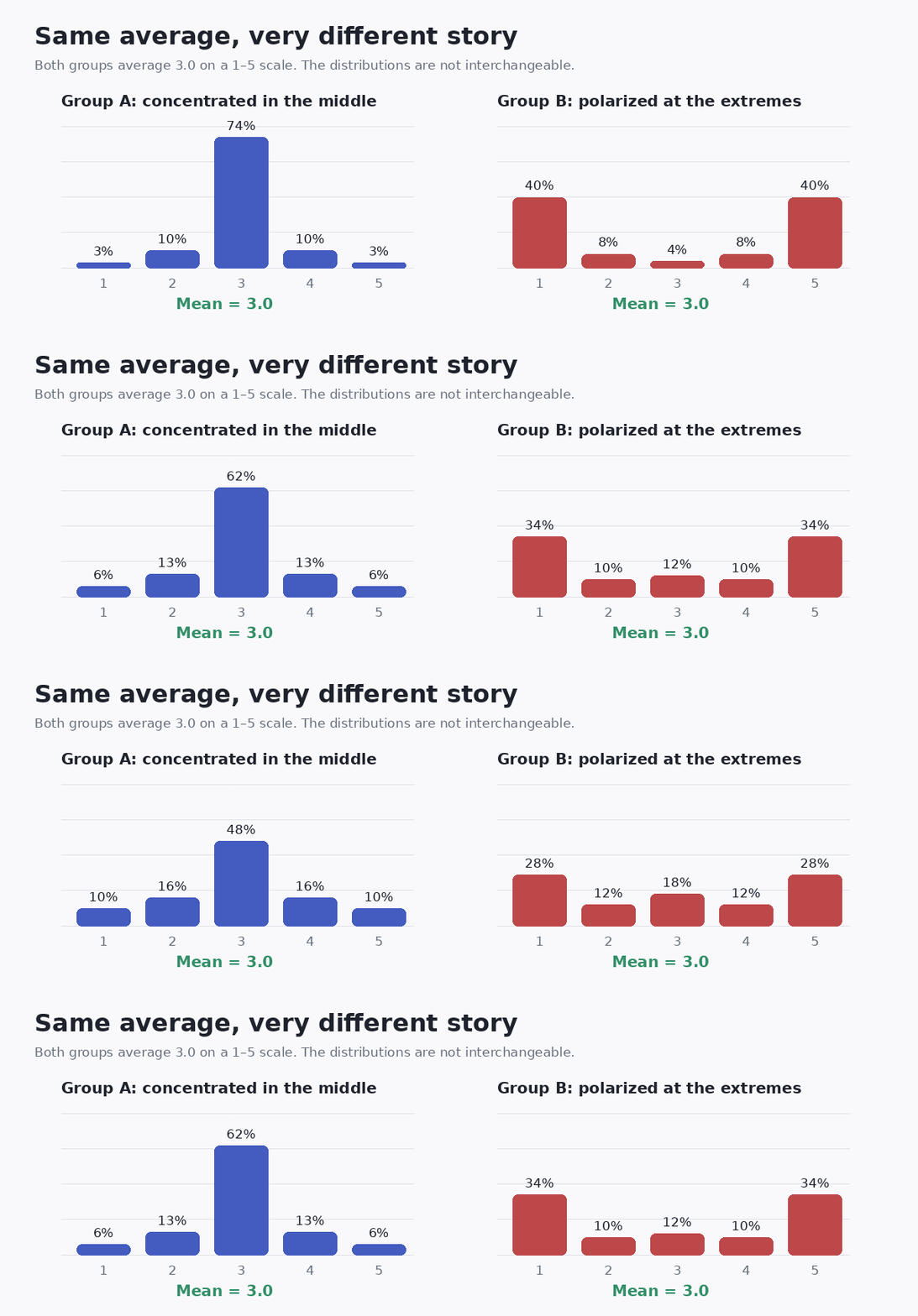
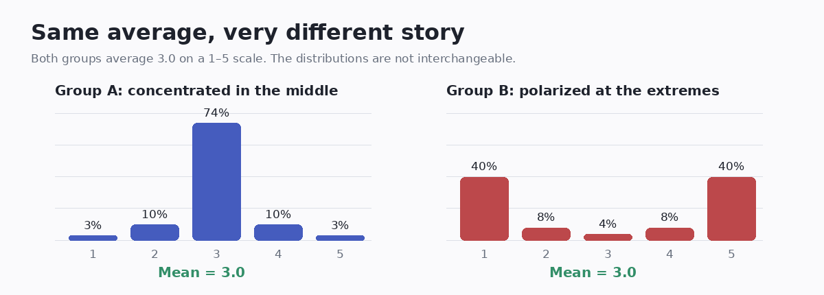
A single average can hide a split audience. A mean satisfaction score of 3.0 on a five-point scale could come from respondents concentrated around neutral or from respondents divided between the two extremes. These situations call for different interpretations and actions.
Use top-box metrics for communication, not as a substitute for the distribution
A top-two-box score might combine “satisfied” and “very satisfied,” while a bottom-two-box score combines the two dissatisfied categories. These measures can make stakeholder reporting simpler, but they discard information. Two groups with the same top-two-box result may have different concentrations of moderately and extremely positive respondents.
Segment respondents where the distinction can change a decision
After understanding the overall result, compare relevant groups such as customer type, region, age band, product tier, tenure, purchase behavior, department, channel, or survey wave. Avoid segmenting by every field merely because the software makes it easy. Useful segmentation is connected to a research question, a plausible explanation, or an action the organization could realistically take.
Cross-tabulate key variables
A crosstab shows how categories in one variable are distributed across categories in another. If overall satisfaction is 80%, a crosstab might show 90% satisfaction among customers who completed onboarding and 55% among customers who abandoned part of the setup process.
That pattern deserves investigation, but it remains an association. It does not prove that onboarding failure caused the satisfaction gap.
How to Analyze Likert Scale and Rating Questions
Likert analysis is frequently oversimplified. The conventional warning that ordinal responses should not automatically be treated as equal-interval measurements is important, but the conclusion “never calculate a mean” is also too absolute.
For a single item such as “strongly disagree” through “strongly agree,” start with frequencies, percentages, the median or mode where useful, and a visualization of the full ordered distribution. These preserve the information that the item is ordinal.
Researchers sometimes combine several related items into a composite scale. In that case, reliability, scale construction, dimensionality, and the intended estimand become relevant. Methodological literature shows that different analytical approaches can be appropriate under different conditions; treating ordinal responses as continuous can be reasonable in some contexts but misleading in others. [3]
For a general business report, a good default is simple: show the distribution first and add an average only when it adds interpretable information.
Do not calculate NPS as an average recommendation score
Net Promoter Score uses a specific transformation of a 0–10 recommendation question. Scores of 9–10 are promoters, 7–8 are passives, and 0–6 are detractors. Standard NPS is the percentage of promoters minus the percentage of detractors. [4]
The underlying 0–10 distribution can still provide useful context, so a headline NPS should not replace distribution and segment analysis.
How to Segment and Cross-Tabulate Survey Results Without Manufacturing Insights
Segmentation is often where survey analysis becomes strategically valuable, but it is also where false confidence grows. A 15-point difference between two segments may look compelling. Before reporting it as a finding, ask whether the groups contain enough observations, whether they differ on other characteristics, whether weighting changes the result, and whether related questions show a coherent pattern.
Subgroup estimates are generally less precise than full-sample estimates because they are based on fewer observations. Pew’s current survey methodology explicitly notes that subgroup estimates have larger margins of error. [2]
There is a second risk: multiple comparisons. If you test dozens of survey questions across many demographic columns, some differences will appear notable by chance. Exploratory crosstabs are useful for finding hypotheses, but they should not convert every highlighted cell into a strategic initiative.
How to Test Whether Survey Results Are Statistically Significant
Statistical testing helps evaluate uncertainty under a defined model and set of assumptions. It does not measure business importance, prove causation, or repair poor sampling.
A chi-square test of independence can test whether two categorical variables are associated in a contingency table when its assumptions are appropriate. NIST describes the test in exactly this two-way-table context. [5]
A two-sample t-test is used for questions about differences in means between two groups under the relevant assumptions. ANOVA extends mean comparison to more than two groups. NIST’s statistical handbook groups these methods with other quantitative techniques and emphasizes selecting methods according to the problem and data structure. [6]
Regression is useful when you want to examine how an outcome varies with several predictors at the same time. The model should match the outcome type, and complex survey samples may require procedures that incorporate weights, strata, and clustering.
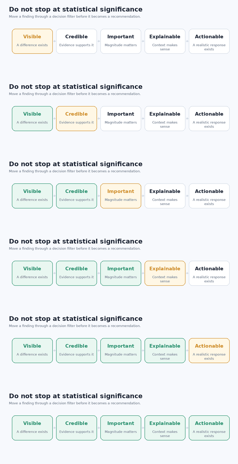
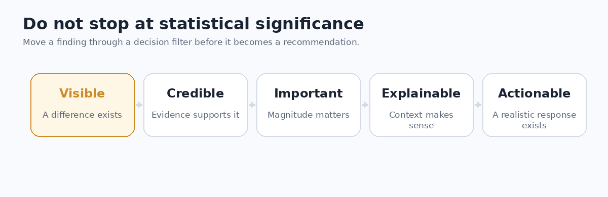
The most important distinction is between statistical significance and practical significance. A tiny difference may become statistically significant in a very large sample while remaining operationally irrelevant. A potentially important difference in a small strategic segment may deserve further investigation even when the available sample gives weak statistical power.
How to Analyze Open-Ended Survey Responses
Open-ended answers often provide the diagnostic layer that rating questions cannot. The purpose is not merely to generate a list of common words. It is to convert unstructured feedback into a consistent analytical framework without losing the respondents’ meaning.
Build a coding framework
Read enough responses to understand the range of issues. Define recurring themes such as “pricing objection,” “slow support,” “checkout failure,” or “missing integration.” Write short definitions for each code so different coders interpret them consistently, and allow multiple codes when a single response covers several issues.
Once coded, themes can be counted, compared across segments, and connected to quantitative outcomes.
Keep the qualitative denominator visible
Suppose 1,000 people complete the survey, 300 leave an open comment, and 105 of those comments mention pricing. You can say that 35% of commenters mentioned pricing. You cannot automatically say that 35% of customers complained about pricing. Only 10.5% of the full sample submitted a comment coded for that theme.
This denominator distinction is small but consequential, especially when open-ended comments are optional.
Use sentiment as supporting evidence
Sentiment can help triage large volumes of feedback, but emotional polarity is usually less actionable than the topic behind it. “Terrible” tells you how someone feels. “Payment failed three times” gives you a problem to investigate.
Use AI to accelerate coding, not to outsource judgment
Large language models can assist with theme generation, text classification, summarization, and sentiment analysis. A documented SurveyCTO example describes Laterite removing personally identifiable information before providing open-text responses to an LLM, giving detailed classification instructions, and retaining human oversight. [7]
A defensible workflow is to define the research objective, remove or protect sensitive data, build a codebook, let the model classify, manually validate a meaningful sample, review disagreements and ambiguous cases, and then finalize counts. If the analysis needs to be reproducible, document the model, prompt or instructions, codebook version, and review process.
AI can reduce processing effort. It does not eliminate coding error, bias, privacy obligations, or the need for contextual judgment.
When Advanced Survey Analysis Adds Value
Advanced methods are worthwhile when they answer a decision that descriptive analysis cannot.
Regression analysis can examine how an outcome varies with several predictors simultaneously. It is useful for driver analysis, but coefficients still require careful interpretation and do not automatically identify causal effects.
Factor analysis can investigate whether a large battery of correlated survey items reflects a smaller number of underlying dimensions. It is most relevant when multiple questions were designed to measure broader constructs.
Cluster analysis can create respondent segments based on similar response patterns. Those clusters still need validation and a real operational use. A mathematically distinct segment that the business cannot identify, reach, or serve differently may have limited practical value.
Conjoint analysis is designed for structured trade-offs among attributes such as price, features, or service levels. Trend analysis becomes important for repeated surveys, but comparison is strongest when wording, sampling, weighting, fieldwork timing, and measurement procedures remain reasonably consistent.
The practical rule is not “use the most sophisticated method available.” It is use the least complex method that answers the decision correctly.
How to Visualize Survey Data Clearly
Choose a chart based on what the reader must compare. Bar charts work well for categorical responses. Stacked horizontal bars preserve Likert distributions. Line charts suit repeated measurements over time. Heatmaps can summarize many related items, while box plots help when spread and outliers matter for continuous variables.
Word clouds can provide exploratory orientation for text but should not stand alone as evidence that a theme is common or important.
Every decision-relevant chart should make the metric, denominator or base, and comparison groups understandable. Use readable labels, sufficient contrast, and text alternatives for key conclusions. Avoid decorative three-dimensional charts or animation that changes the meaning of the data.
The purpose of a visualization is not to make the survey look sophisticated. It is to make the evidence difficult to misunderstand.
Best Tools for Analyzing Survey Data
Tool choice should follow analytical complexity, repeatability, team skill, data sensitivity, and reporting needs.
Microsoft Excel and similar spreadsheets are often enough for small or moderately sized descriptive analyses. PivotTables can calculate, summarize, and compare structured worksheet data, which makes them useful for frequencies and simple crosstabs. [8]
R is a free environment for statistical computing and graphics and is useful when the analysis needs reproducible code, specialized statistical packages, or publication-quality analysis. [9] Stata has dedicated survey methods that account for sampling weights, clustering, stratification, poststratification, and complex survey inference. [10] SPSS offers a graphical workflow familiar to many research teams, while Python is strong when analysis must be integrated into data pipelines, automation, or custom text-processing workflows.
Interactive reporting tools such as Power BI or Tableau become useful when stakeholders need recurring dashboards and filters. They do not replace the statistical decisions made upstream.
For many teams, the best progression is simple: use the easiest tool that handles the analysis correctly and can be maintained by the people who must repeat it.
Common Survey Data Analysis Mistakes to Avoid
The most damaging mistakes are often conceptual rather than mathematical.
| Mistake | Why it fails | Better approach |
|---|---|---|
| Cleaning by deleting inconvenient responses | Exclusions can create analyst-driven bias. | Define quality rules from validity evidence and document them. |
| Reporting percentages without a base | The same numerator can imply different stories under different denominators. | Show n/base whenever the denominator is not obvious. |
| Using only averages | Polarization and skew can disappear. | Inspect the full distribution first. |
| Treating sample size as representativeness | A large biased sample can still estimate the wrong population. | Evaluate coverage, selection, nonresponse, and weighting. |
| Assuming weighting only improves accuracy | Unequal weights can reduce effective precision. | Account for design effects in inference. |
| Treating every significant crosstab cell as an insight | Many tests increase the chance of chance findings. | Prioritize planned questions, coherent patterns, effect sizes, and replication. |
| Calling association causation | Cross-sectional survey relationships may have alternative explanations. | Use causal language only when the design and evidence support it. |
| Calculating NPS as an average | NPS has a defined promoter-minus-detractor formula. | Use the standard calculation and inspect the underlying distribution. |
How to Turn Survey Findings Into Actionable Insights
A finding becomes actionable when evidence connects to a decision. A useful framework is Observation → Confidence → Implication → Action → Measurement.
Consider a fictional product survey. Overall satisfaction is 85%, but enterprise satisfaction is 40%. The enterprise sample is large enough for the intended comparison, the gap persists under the relevant weighting, and related questions show the same direction. Open-ended comments from that segment repeatedly mention permissions, identity management, and administrative complexity.
Observation: enterprise customers are much less satisfied than the overall customer base. Confidence: the pattern is not dependent on one small cell or one question. Implication: the headline satisfaction metric is masking a problem among strategically important customers. Action: investigate enterprise administration workflows before funding a broad redesign that affects every customer. Measurement: track the specific workflow metrics and enterprise satisfaction in the next comparable survey wave.
Notice the restraint. The survey identifies a credible segment-specific problem and gives plausible areas for investigation. It does not prove that adding one particular feature will cause satisfaction to rise.
How to Present Survey Results to Stakeholders
Decision-makers rarely need every table you created. Lead with the decision-relevant finding, then show the evidence required to interpret it.
A strong narrative moves from what happened to who is affected, how confident the evidence is, what may explain it, and what should happen next. Show base sizes where they matter. Display full distributions when averages could mislead. Pair quantitative patterns with carefully selected, anonymized comments only when those comments illuminate the pattern rather than decorate the presentation.
State material limitations directly. If a subgroup is small, say so. If the survey is an opt-in sample and population inference is limited, do not imply representative precision that the design cannot support. If a trend comparison includes a questionnaire or sampling change, annotate the break.
A dashboard is useful when the same survey is repeated and stakeholders need consistent monitoring. It becomes dangerous when interactivity encourages unplanned slicing until an attractive story appears.
Frequently Asked Questions About Survey Data Analysis
What is the first thing you should do when analyzing survey data?
Define the research question and validate the dataset before producing headline findings. Check eligibility, duplicates, missingness, routing, unusual response patterns, and relevant metadata. You need to know what each analytical base represents before calculating percentages or comparing groups.
What is the easiest way to analyze survey data?
For a straightforward survey, start with a spreadsheet. Calculate frequencies, percentages, relevant medians or means, and a small number of decision-relevant crosstabs. Move to dedicated statistical software when you need complex weighting, survey-design adjustments, regression, extensive inference, automation, or reproducible code.
How do you analyze Likert-scale survey data?
Start with the ordered response distribution. Frequencies and percentages preserve the information in an individual Likert item. Additional summaries or inferential methods may be appropriate depending on whether you are analyzing one item or a validated multi-item scale, what the categories mean, and which assumptions the method requires.
How do you know whether survey results are statistically significant?
Choose a statistical test that matches the variable types, research question, sample design, and assumptions. For complex survey data, the inference may also need to incorporate weights, clustering, stratification, or other design features. Statistical significance is only one part of the decision; effect magnitude and practical importance still matter.
How large should a survey sample be?
There is no universal sample size that makes every survey reliable. Requirements depend on the population, sampling design, desired precision, subgroup analyses, expected effect sizes, response patterns, and analytical method. A large sample does not automatically make a biased sample representative.
Can AI analyze survey responses?
AI can assist with thematic coding, summarization, classification, and sentiment analysis. For decision-relevant work, protect sensitive information, provide explicit coding criteria, validate classifications against human review, and document the workflow when reproducibility matters.
Should incomplete survey responses be deleted?
Not automatically. Examine how much data is missing, where the respondent dropped out, whether missingness is systematic, and whether the planned analysis requires complete cases. Deleting all partial responses can remove useful information and may introduce bias.
What is the difference between statistical significance and practical significance?
Statistical significance evaluates an observed result relative to a null model and assumptions. Practical significance asks whether the size and consequences of the difference are large enough to influence a real decision. You need both questions before committing resources.
Conclusion: Analyze for Decision Quality, Not Analytical Volume
The central lesson in how to analyze survey data is not to perform every calculation your software offers. It is to build a defensible chain from response quality to decision quality.
For beginners, researchers, product teams, customer-experience teams, marketers, HR teams, and program managers, the highest-impact actions are usually the same: validate the data before analysis, keep denominators visible, examine distributions before averages, segment only where the distinction can change a decision, combine quantitative and qualitative evidence, and separate statistical credibility from practical importance.
The important limitation is that a survey can only support conclusions justified by its sample, measurement, and design. Statistical sophistication cannot rescue a fundamentally inappropriate sample or a poorly worded question.
The next sensible action is to lock the cleaned analysis dataset, document the exclusions and bases, calculate the core distributions, and then ask the question many survey reports forget: what will we measure next to determine whether the action worked?
Sources
You May Also Like How to Report Statistical Results in APA 7